GET STARTED?
Convert any Section on your page to a Tabbed Content with just 1-Click.

This plugin is 100% Visual Builder Compatible.
This plugin is 100% compatible with the Divi Visual builder and really simple to use. However, you won’t preview the Section as Tabs in the visual builder. And that’s intentional as you need to view & edit the content of the section as you normally do. So in the visual builder, it will remain as it is now but will have additional options to convert the section into Tab. Once enabled all the rows within that section will become tabs on the front-end of your website. Easy huh?

How to Get Started?
1. Introduction
Convert any section on your page to a Tabbed Content with just 1-click. This makes each row in the section to a tab content. Make websites with complex tabs in the easiest way now!
2. Installation and Activation
MINIMUM REQUIREMENTS:
- WordPress 4.5 or greater
- PHP version 7.0 or greater
- MySQL version 5.0 or greater
- Divi Latest Theme or Plugin
WE RECOMMEND YOUR HOST SUPPORTS:
- PHP version 7.0 or greater
- MySQL version 5.6 or greater
- WP Memory limit of 64 MB or greater (128 MB or higher is preferred)
HOW TO INSTALL:
- Install using the WordPress built-in Plugin installer, or Extract the zip file and drop the contents in the wp-content/plugins/directory of your WordPress installation.
- Activate the plugin through the ‘Plugins’ menu in WordPress.
- Then Go to Plugin > Divi Tab Section
- Enter License Key
- Activated the Plugin
- Hurray :).
3. Get Started
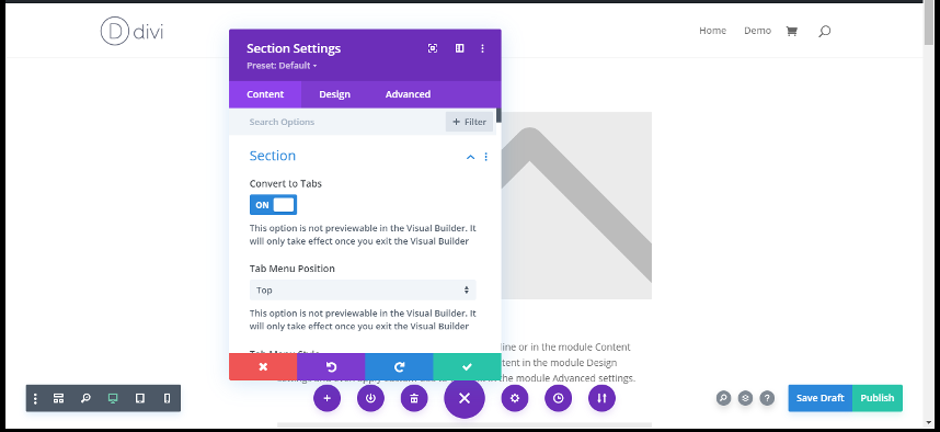
For this simple action to take place of converting all rows of a section into tabs, first go to settings, select section settings and turn on the convert to tabs option. It is very important to enable this option in the beginning because this will allow your rows to get converted to tabs instantly. Saving these settings is essential and once settings of convert to tab is saved, the plug-in automatically converts all rows into tabs.
- Click the Settings section that you desire to convert into Tabs.
- Click Convert into Tab “Turn On“
- Save Setting and here you go.
Isn’t so easy?
Main Features
There are bunch of exciting features. See Below “How To Use Divi Tab Section“.
1. Change Tab Name
You can change Tab Text Name by Section Setting.
- Go to Section Setting
- Collapse Admin Label
- Write Custom Tab name
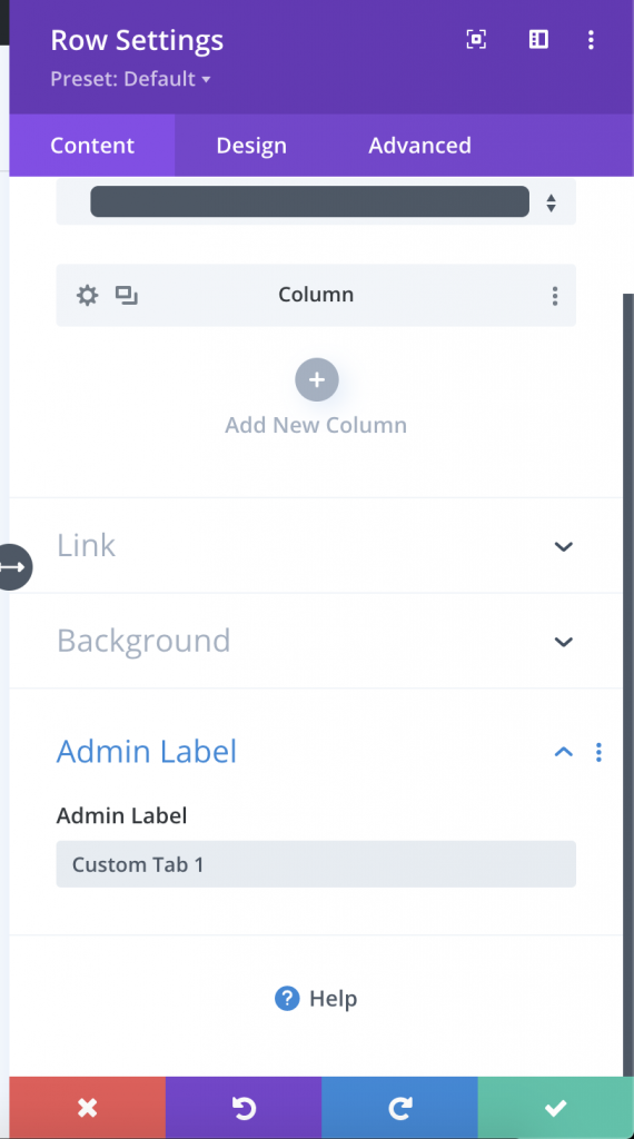
Now you can write in RTL Text as well along with Emoji.
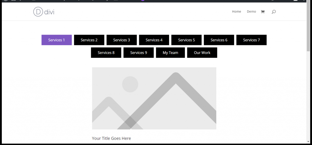
2. Tab Menu Position

- Click the Settings section that you desire to convert into Tabs.
- Change Tab Menu Position “Top” And “Bottom”
- Save Setting and here you go.
2. Tab Menu Style (New Feature)
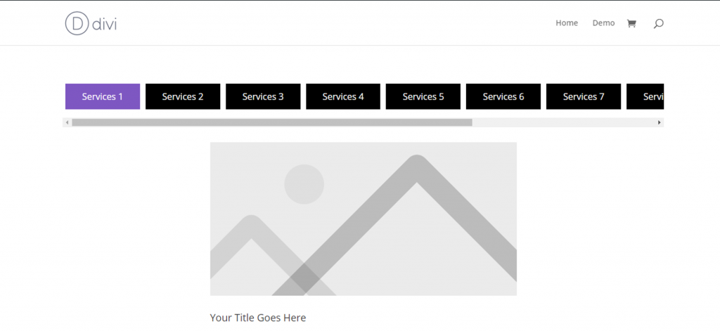
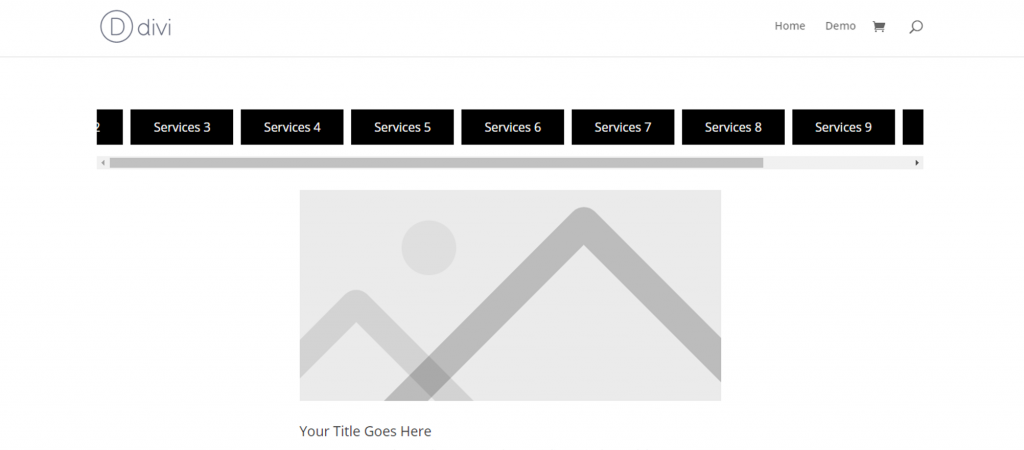
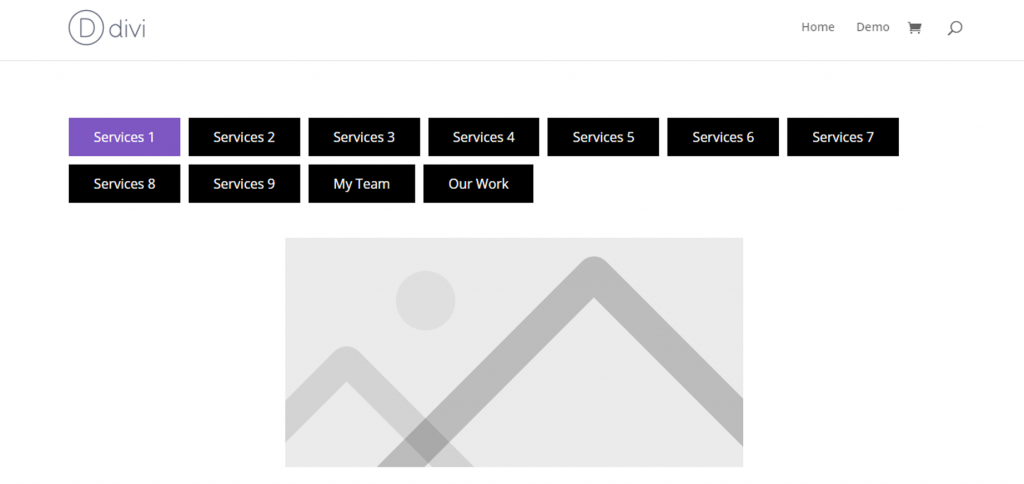
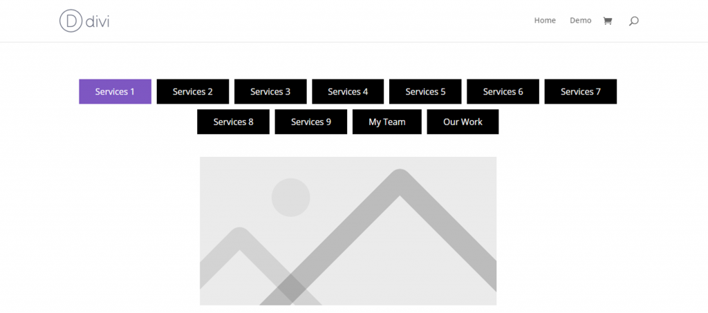
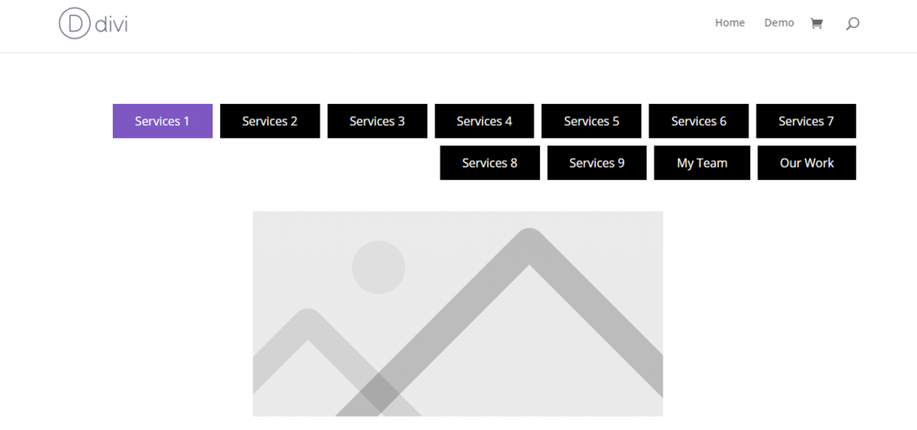
This setting has two options of Carousel and Text Wrap for you. Carousel setting is set by default and in this particular setting, all tabs in the menu are not visible if they increase in number, thus a scroll left to right button has to be used to check out the entire menu.
- Click the Settings section that you desire to convert into Tabs.
- Change Tab Menu Style. There are two styles “Carousel and Wrap”.
- Change Table Menu Alignment. (For improved user experience, the tab menu visibility is extended to three options of alignment, so now you can align your tab menu to the left, to the right or in the center. For both Carousel and Wrap settings, this option can simply be enabled by just a click!)
Carousel Style
Left
Center
Right

Wrap Style
Left
Center
Right
4. Container Width
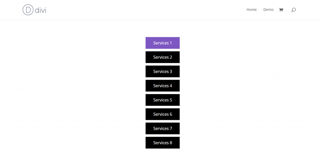
This option is your section settings enables you to set and keep the width of the container bar that adjusts the menu within it. Starting from 13 as the least value to keep the container width, keeping the smallest value will give you this look:
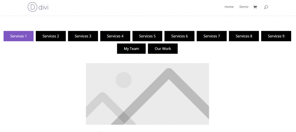
Whereas the more the width, the better in looks as more menu tabs can be adjusted within it. The range can be kept as high as 100 which is the highest value available for this range. At 100 in container width, it gives a look like this:
4. Custom Style
if you turn on custom style. You would see amazing new and old features to manage tab menu text and background styling.
- Click the Settings section that you desire to convert into Tabs.
- Just Turn On “Custom Style for Tab Menu”.
5. Tab Menu On Mobile Responsive
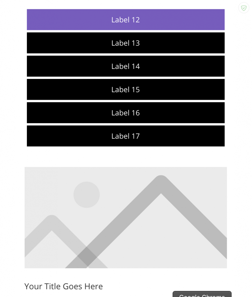
This update is of another heading in your section’s setting named as ‘Make Manu tabs full width on mobile’. This option basically allows the menu tab to adjust itself to full width and length for mobile users to show the entire menu on their screens. Let see here how this works:
6. Tab Menu Background
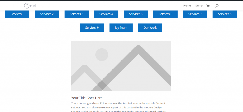
Tab Menu Background is used to set the background color of tabs as per your choice. If chosen blue, the background of menu tabs will look like this.
7. Tab Menu Border Style (New Feature)
Border Width
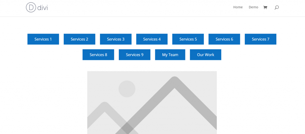
The third update is called the ‘Tab Menu Border Width’. This feature as the name suggest gives your border the desired width you wish to keep. It is the distance of each border from the next tab border. Once you have set the figures for border width for top & bottom, left to right, just a click and you are good to go!
With 5px from each side set, your front-end tab menu presentation will look something like this:
Border Style and Color
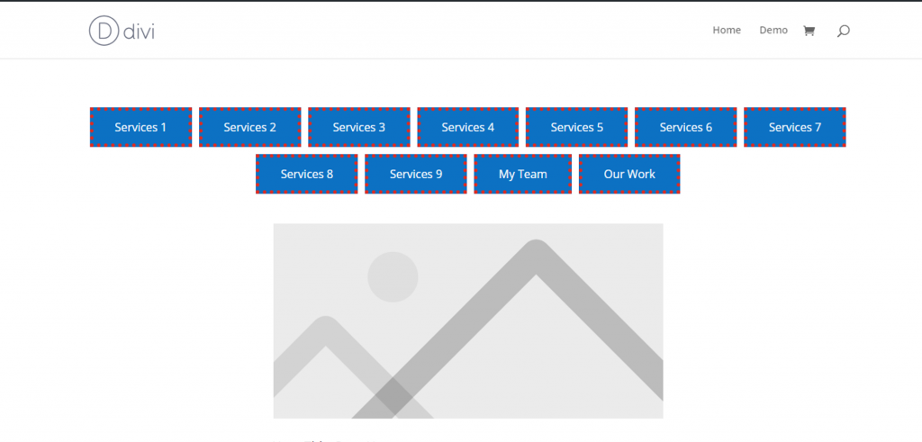
The fourth honorable mention are two different settings of ‘Tab Menu Border Style’ and ‘Tab Menu Border Color’ that can change your border styles and color and make them look even more catchy and attractive. With options available from solid, dashed, dotted and double, you can select the border style you wish to keep. A bunch of color are available to choose from. It increases and highlight my borders visibility. Here is how my border looks with dotted border style in red color.
Border Radius
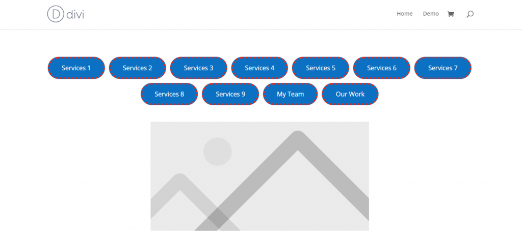
Keep going further and your tab menu will reach a classic and eye catchy look by the end of the style customization. Next place is taken over by ‘Tab Menu Border Radius’. This option enables you to set the radius of the border that can make it curves from the end if you choose to keep it that way. For better visibility, I kept it at 40 px each side and here is how it looks:
9. Tab Menu Font and Text Style (New Feature)
Font/Text Color
‘Tab Menu Text Color’ allows you to select and change any color of the text used in the menu tabs. Text color in black looks like this:
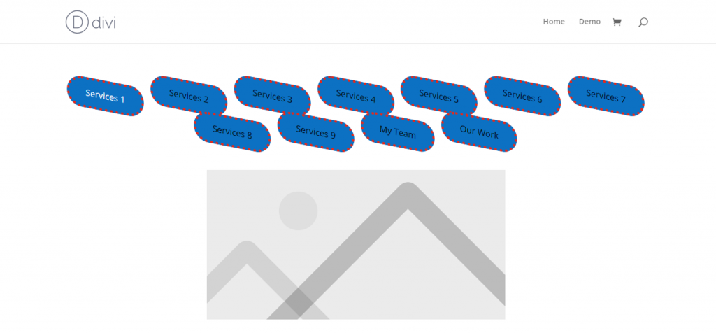
Font/Text Family
‘Tab Menu Text Font’ is another feature that improves and completes the look of the text by making it visible in any font family you desire to select. When selected Advent Pro, the text in menu tabs look like this:
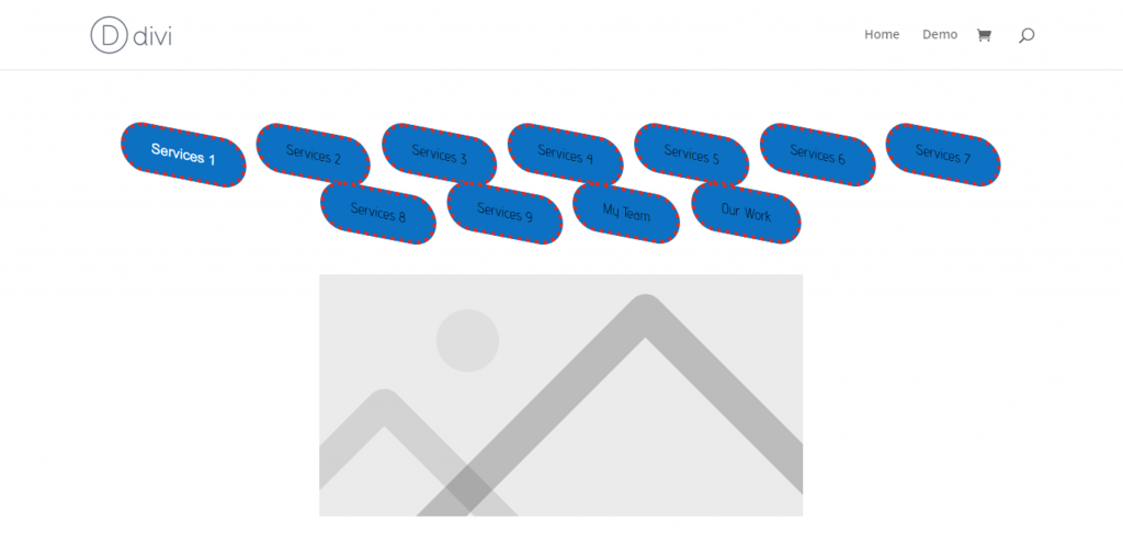
Font/Text Weight
‘Tab Menu Text Weight’ gives you options like light, semi bold, lighter, regular, bold and ultra-bold to decide from and keep the text weight upon any style option you choose. Regular is set by default and can be changed by just a click. Light and Bold looks may give the following presentations:

Font/Text Alignment
With ‘Tab Menu Text Alignment’, now you can not only align the menu tabs but the text can also be aligned from the left, right or in the center.
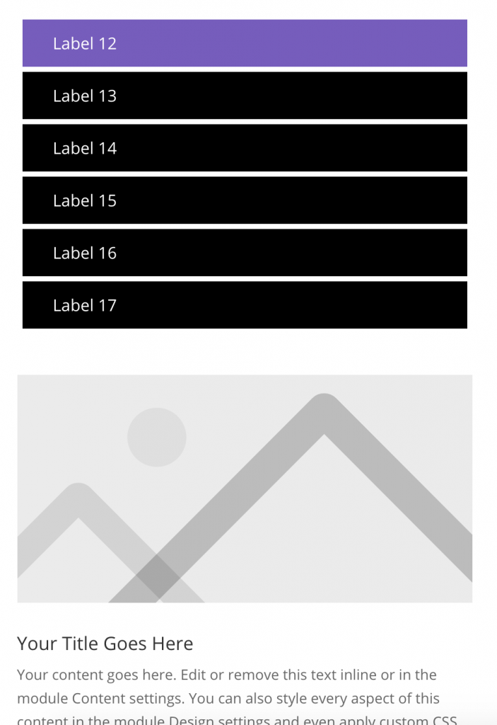
Font/Text Size
‘Tab Menu Text Size’ gives you the access to change the font or the text size and make it bigger or smaller as per you desire to keep it on the menu tab. With 25px chosen, the text size is visible like this:
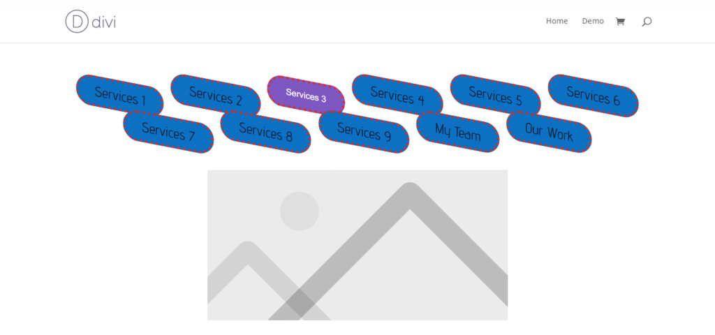
Font/Text Italic
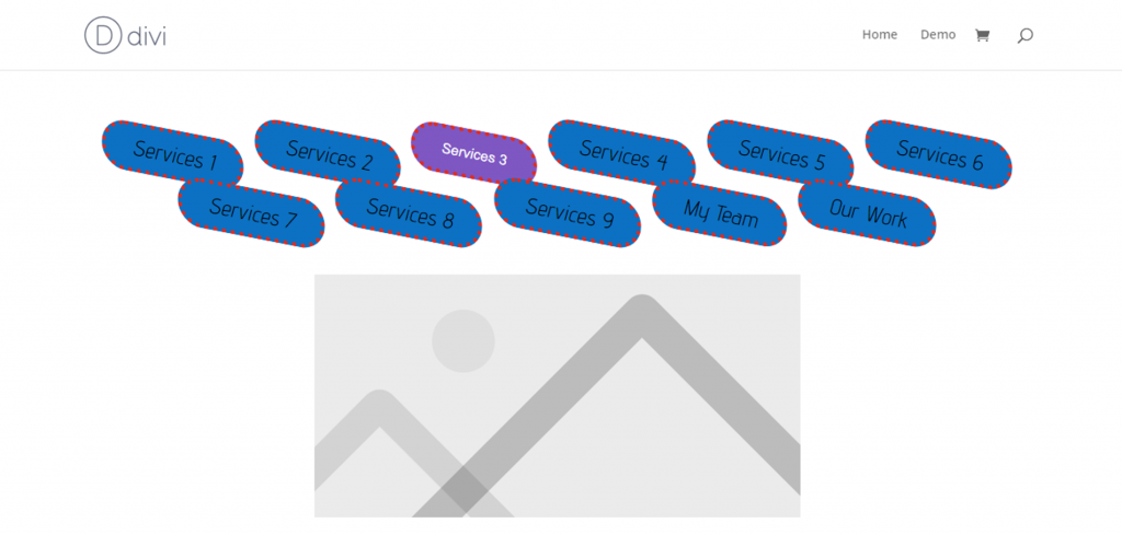
‘Tab Menu Text Italic’ is an added feature which converts your tab menu text to Italic and give it a more wonderful look. The preview is here:
Font/Text Underline
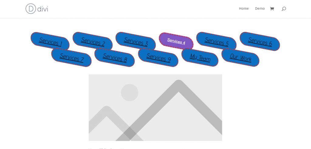
You can also use ‘Tab Menu Text Underline’ to get all the tab menu text turned underlined.
Font/Text Transform
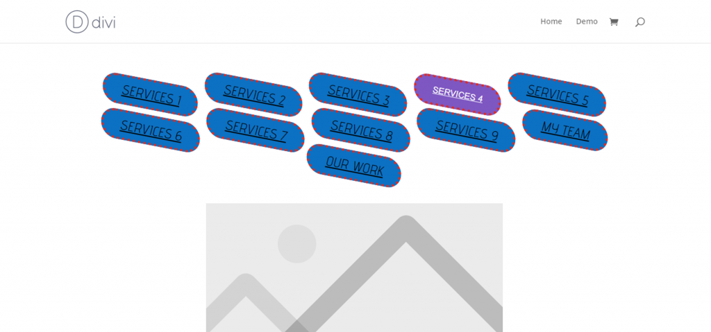
‘Tab Menu Text Transform’ is an incredible feature and allows you to completely shift your tab menu text to upper case or lower-case form, so whatever you chose will be used in the tab menu. There are two types of transform (uppercase and capitalize).
8. Tab Menu Transform (New Feature)
Rotate
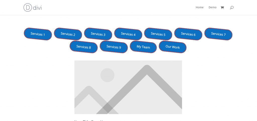
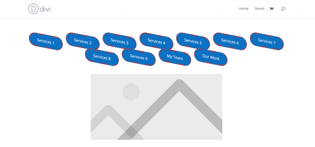
Let’s come to the next customized setting option of ‘Tab Menu Item Rotate’. This updated feature of Divi Tab Section allows you to set an angle at which you wish to keep the menu bar to get rotated. If not set, it will stay with the default settings of a normal tab menu. Rotating it at an angle gives good visual effects, so trying it to fascinate more viewers is definitely worth it. It looks like this with a 6-degree angle rotate:
Skew
Another worth mentioning 1.3 version update is the ‘Tab Menu Item Transform’ for both X axis and Y axis. This visual effect will skew and give more catchy 3D effects to your menu items. Such an impressive look can be created here by selecting a number of degrees you want your items to set and look to. Here is an image of 5 degree transformation for each X and Y axis for all items on the menu bar:
11. Hover and Active State (All New Feature)
‘Tab Menu Hover/ Active settings’ allow you to use and set all custom styles and features available for the normal tab menu settings. The list of features available for hover/ active settings is as follows:
- Tab Menu Background Color
- Tab Menu Border width
- Tab Menu Border Style
- Tab Menu Border Color
- Tab Menu Border Radius
- Tab Menu Item Rotate
- Tab Menu Item Transform X
- Tab Menu Item Transform y
- Tab Menu Text Color
- Tab Menu Text Font
- Tab Menu Text Weight
- Tab Menu Text Alignment
- Tab Menu Text size
- Tab Menu Text Italic
- Tab Menu Text Underline
- Tab Menu Text Transform
Request a Feature or Open a Ticket
You can ask us a question or Hire us.

